Reimagining Parking
Updated 11.8.2021
Exploring Design
This project was my first large-scale UX design project. Looking back, there are many elements of this project (research, ideation, the wireframes themselves) that could be improved. Still, I'm leaving this project here to share the starting point of my journey through web design and development.
Just a Parking App
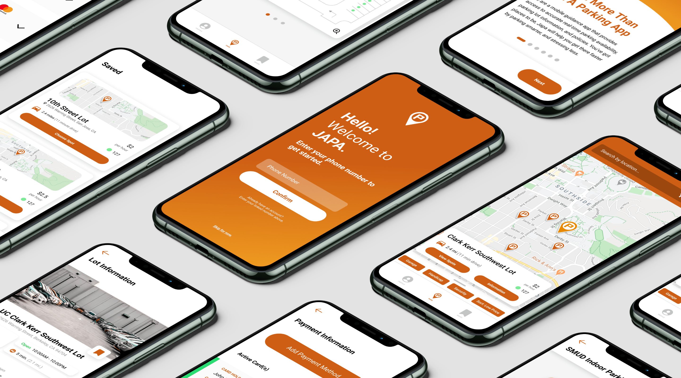
JAPA, or Just a Parking App, is a mobile app that provides real time parking availability to users at universities, corporate campuses, and beyond. In addition to viewing which individual spots are open, users can view parking lot policies and get driving directions. JAPA’s motto is “Park Smart. Stress Less.”, something that guided our decisions throughout the project.
Visit them at https://www.parkjapa.com/.
Present and Future
Over the course of the 5 weeks, we worked closely with JAPA’s CTO to better understand their needs in the app and gain feedback on our work in progress.
Prior to the project, JAPA already had an app on the market, but it was a bare bones app lacking a lot of the functionality JAPA plans to implement in the future. Our job was to fill in the gaps. We needed to both:
- Improve the existing interface
- Design for scalability and the addition of features
Duration
5 Weeks
Apr - May 2020
Team Members
Edward Chew (Me!)
Briana Omori
Miranda Wong
Kiara Cowderoy
Gaining Insight & Developing Ideas
An Inefficient App for Efficiency
In order to identify issues in the current app, we spoke to different user groups and conducted a user task analysis. Each participant was given a task—like finding an open parking spot or locating a particular parking garage—and we observed the steps they took to fulfill the task. Sometimes they cruised through the app, other times they hit the wrong button or hesitated. This told us which screens were laid out effectively and which weren’t.
We found three broad issues:
- The app is slow. To find a parking lot, a user would need to manually zoom into the map and click on the correct pin.
- The app is visually confusing. Users did not understand the iconography. What did the colors of the dots mean? Other times, clusters of pins indicating parking lot locations looked like one pin, instead of multiple.
- The app lacks direction. This was the big one. Upon opening the app, a user does not know what the app does, what the visual symbols mean, or where to go and what to do. Some design elements in an application can rely on a user’s intuition, but often not.
The current state of the JAPA app, including the parking lot map, parking space map, and lot information page.
Understanding the Business
At the end of the day, JAPA is a business. Beyond providing a seamless parking experience to users, we needed to understand the needs of the business.
JAPA currently does not monetize their mobile app. A user never needs to pay anything, nor do they ever see an ad. Instead, JAPA’s revenue comes from parking lot managers. By paying JAPA to have parking sensors installed in their parking lot, a parking lot manager is given access to a lot management dashboard, where they can see different metrics of the parking lot’s usage.
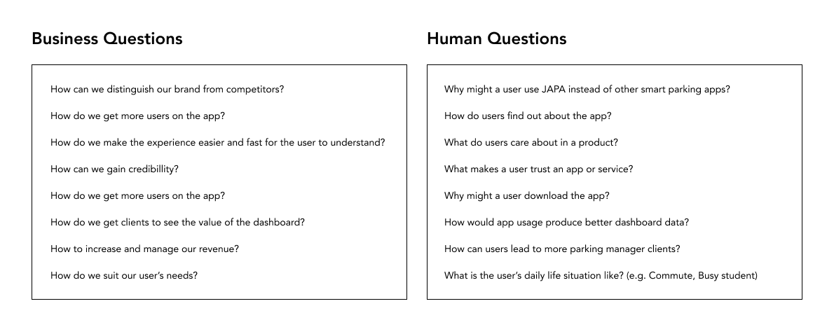
We addressed this business-user divide by writing business questions and converting them to human questions.
For example, “How do we distinguish ourselves from our competitors?” becomes “Why might a user use JAPA instead of other smart parking apps?” These questions can sometimes seem trivial, but seriously considering the answers to the questions helps us consider what values should guide our decision making in the design process.
A selected handful of the Business to Human questions.
Checking Out the Competition
Why might a use JAPA instead of other smart parking apps? Well, we first need to know what the other smart parking apps have to offer. Our team compiled a list of JAPA’s competitors, including some parking unrelated apps that the JAPA team liked the UI of. We each studied a couple of the apps, testing out their parking search function and compiling a list of features.
We compiled all our notes in a competitive analysis matrix, comparing what features each app did—or more importantly—didn’t have. We examined what features JAPA was lacking, and based on our experiences in testing the competitors’ apps, we could determine whether those were valuable features to include.
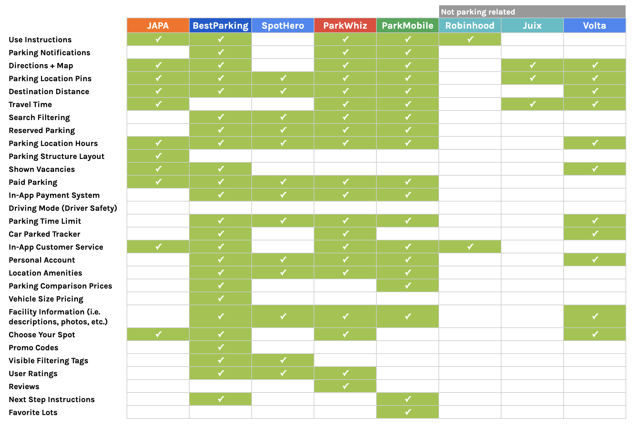
The competitive analysis matrix.
The Road from A to B
One of our top priorities in the redesign of the app was maximizing efficiency, which made it vital to minimize the number of screens a user needed to go through to complete their task. We wrote out the primary flow a user would take through the app, otherwise known as The Golden Path. We used this to identify the essential screens within the app and how we could optimize the flow from one screen to the next.
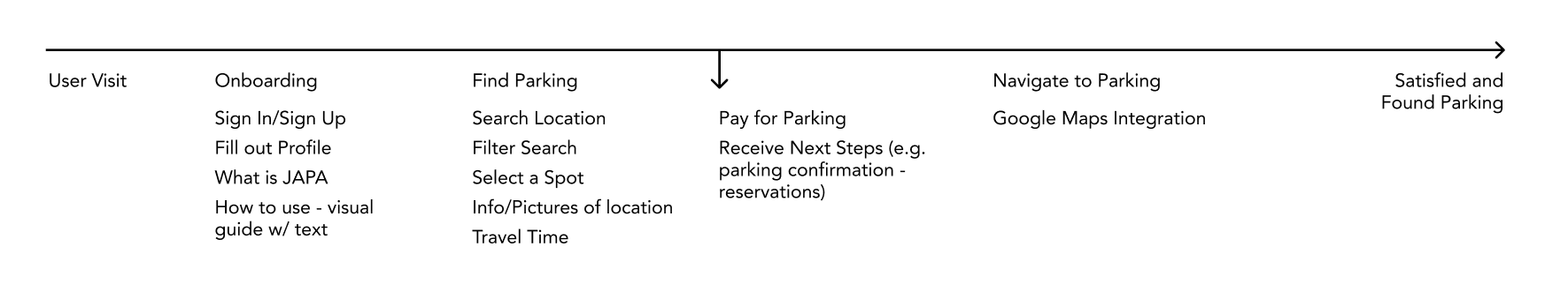
The most important elements of the app that a user would pass though.
Creating Solutions
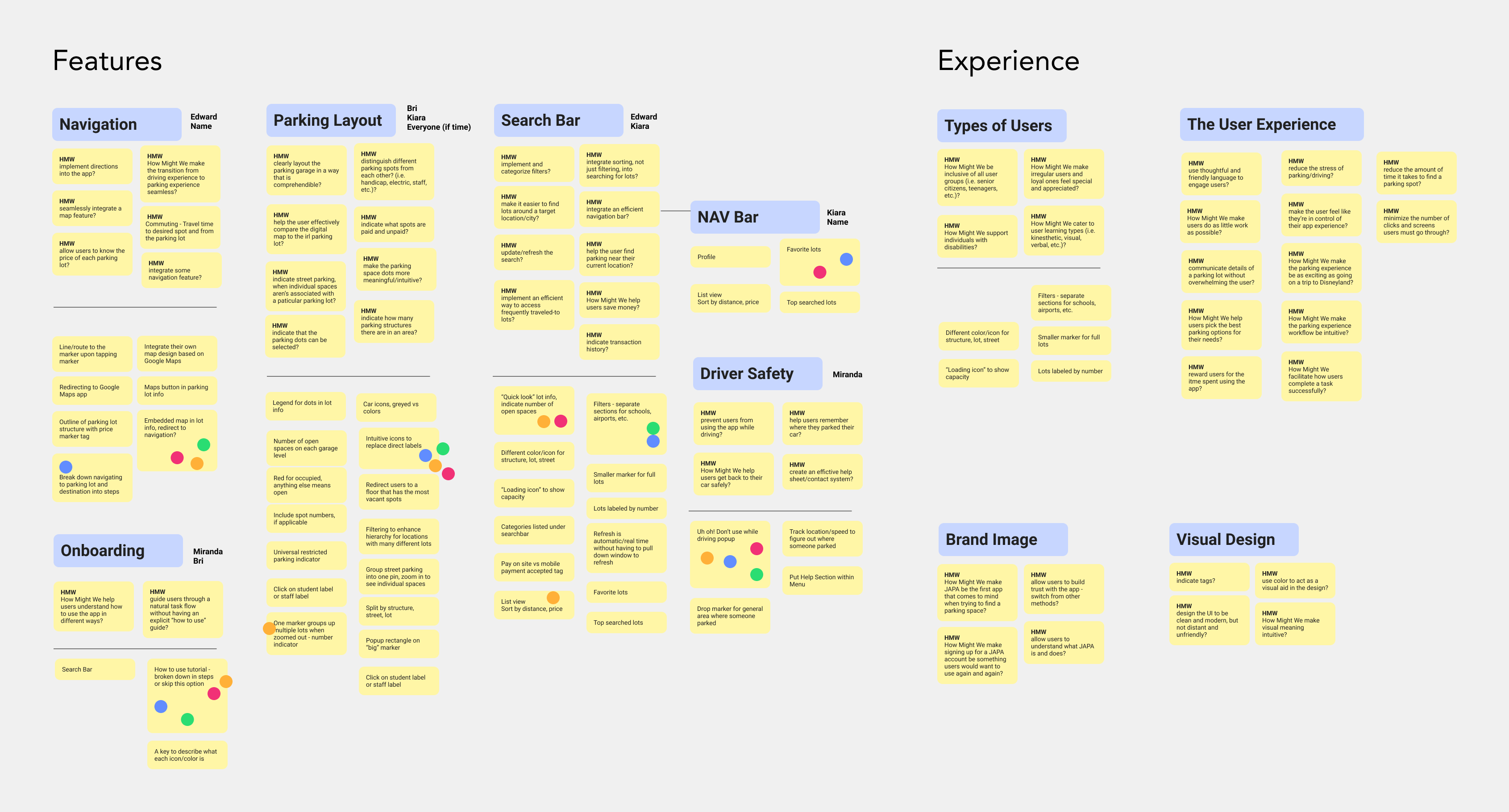
After synthesizing all of our research, we wrote out different “How Might We?” questions to identify issues in the app. We then organized these into categories to find the broader problem spaces to focus on, such as navigation or the parking layout feature. Not only did this help us identify the necessary features for the app, some questions served as goals for the whole project: maximizing visual appeal, making the app recognizable to users, and the focus on efficiency.
With the list of design issues in hand, we prioritized them based on the insights gained from our user research. We brainstormed answers for these questions, some drawn from our competitive analysis, some based on the current state of the app, others on potential features. With our massive list of ideas, we discussed and voted to select those that could most effectively solve user problems.

The Affinity Mapping process: synthesizing the research into HMW questions, grouping questions, then creating solutions.
Sketching Things Out
Next came sketches! We split the features up and we each scribbled out different ideas and layouts. With sketches, we could test out many different designs without taking too much of our time.
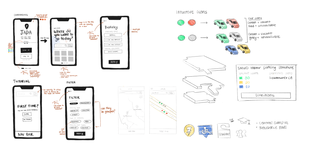
Sketches by Kiara Cowderoy and Briana Omori.
Design & Prototyping
Perfecting the Spot
What set JAPA’s app apart? The spot. No major parking app on the market could identify which individual parking spots were available or occupied. This was a feature to be highlighted.
Let’s take a look at the original state of the app.
Parking Spot Map
Lot Information
The parking spot map is full of green and red dots, and a user might assume red means occupied and green means available.
When we shift our attention to the lot information page, we see there are actually quite a few types of parking, from “Disabled Person” to “Residence Hall”. But which spaces in the map fall into these categories? Could the red and green be indicators of space type instead of space availability?
Let’s make things clear.
Here was our first iteration of the spot icons. Instead of the two icons, we now have six. A blank icon to indicate regular spots, a wheelchair icon to indicate handicapped spots, and a lightning bolt to indicate electric vehicle charging spots. Each icon then has its red counterpart to indicate it was occupied. The red and green colors were also adjusted to better complement the rest of the app design.
Original

Redesigned

But there’s a problem. The vast majority of parking spots in public parking lots fall into the above categories, but not all. What about the parking spots restricted to faculty? Or residence hall residents?
Cue the “Restricted Spot”, an umbrella icon for any parking spots with special restrictions.
The Restricted Spot

As part of our usability testing in our prototyping stage, we put these new icons to the test. We noted two things:
- Now that there were more colors involved, users had more difficulty picking out the red, occupied spots.
- Users interpreted the “R” icon as “Reserved” instead of “Restricted” like what aimed for.
In our final iteration, we changed the “R” symbol to a star, and used a brighter red for occupied spots.
The Final Icons

What the Lots Have to Offer
JAPA exists because parking spots are a scarce resource. More scarce than parking spots in general, though, are specific types of parking spots. If a person requires a handicapped parking spot, there’s no reason to enter a lot even if regular parking spots are available.
Instead of indicating the total parking spaces like the current app, we decided to indicate the available parking spaces. This feature was designed in parallel to the parking icons, and it was necessary to adapt it accordingly.
Original
Redesign
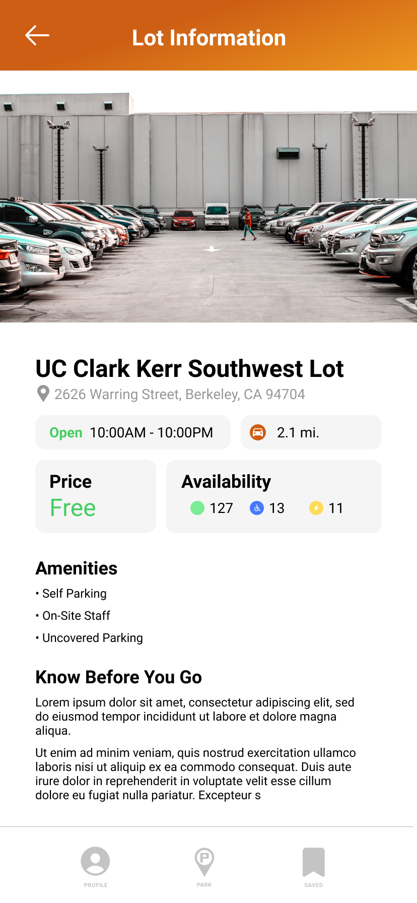
Here was an early design of the lot information screen. The information on the screen was rearranged, highlighting the important details like the price, the address, and, of course, the available parking spots!
Let’s focus on the “Availability” box. It uses the same icons that we created earlier.
Iteration 1
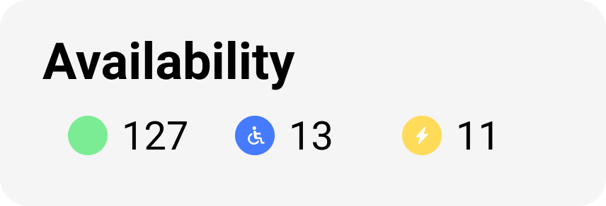
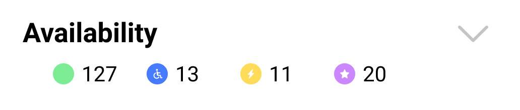
The first design, and also the simplest. Bare bones and only supports three types of parking spaces.

Iteration 2
This second design was a leap forward. The restricted parking spot was added, and the box was now an element that could be tapped to expand it.
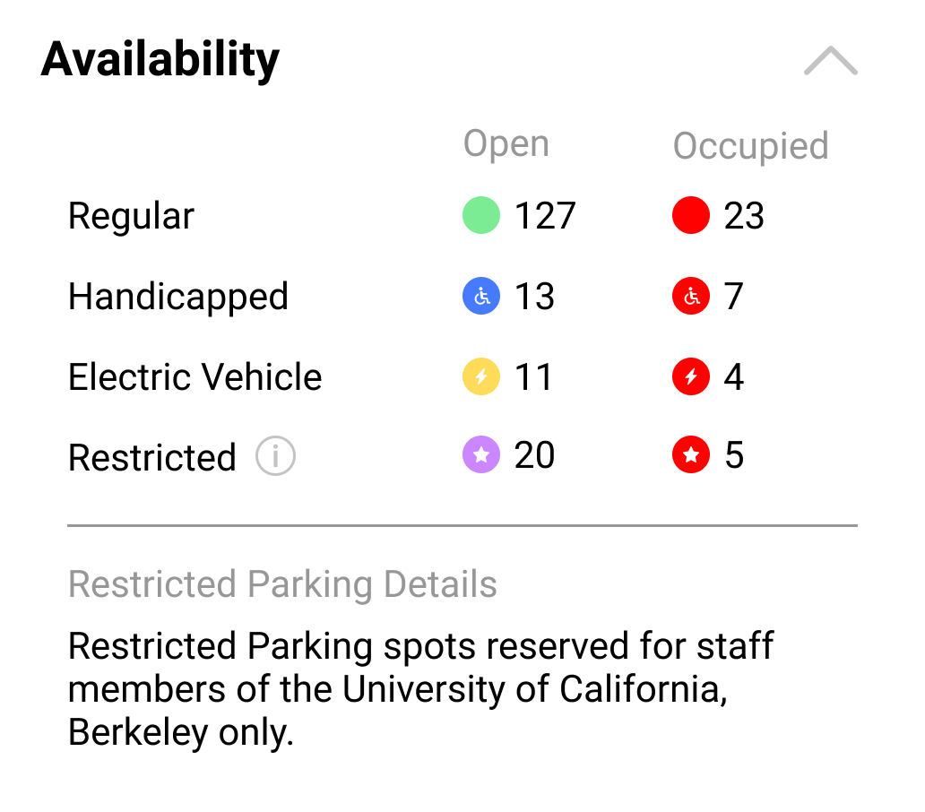
When only indicating the available spots, and not the number occupied, a user would not have a sense of the size of the lot (and the probability an occupied space would free up). The expanded box also provides information on the nature of the restricted parking spots.
Iteration 3
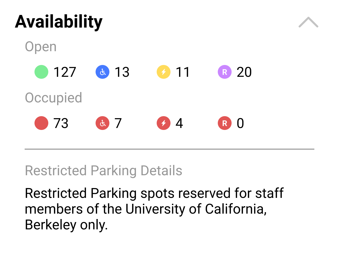
The design in the previous design still relied on a user’s intuition to understand what the icons represented. In our usability testing, many identified the “R” icon as “Reserved” instead of “Restricted”, so we knew we couldn’t make the assumption that users would recognize the icons’ meanings.
This new design took the guesswork out of things. Each type of parking spot is explicitly labeled, including which colors represented open or occupied spots.
This design also gave room for expansion. Should new parking spot types be introduced to the app later on, they can be easily added without rearranging the screen’s layout.
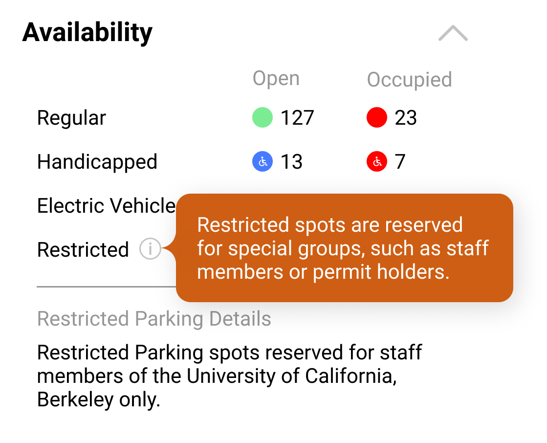
Still, the concept of a restricted space could be tricky for users. To make things clear, we added a tooltip by the restricted label that explains what a restricted parking spot is.
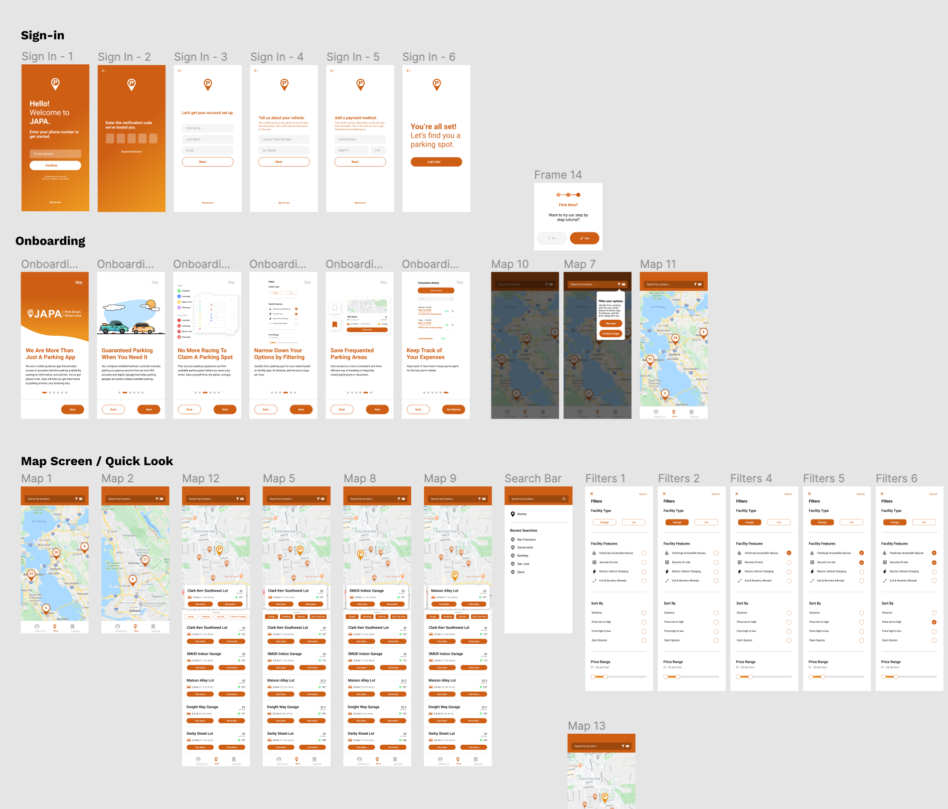
The Final Prototypes
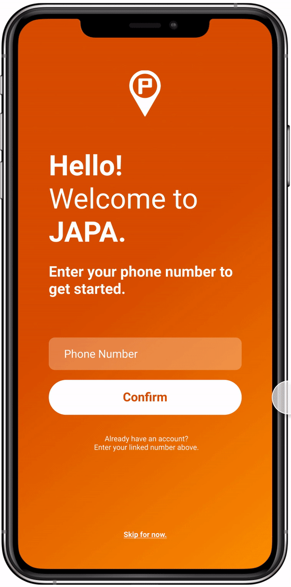
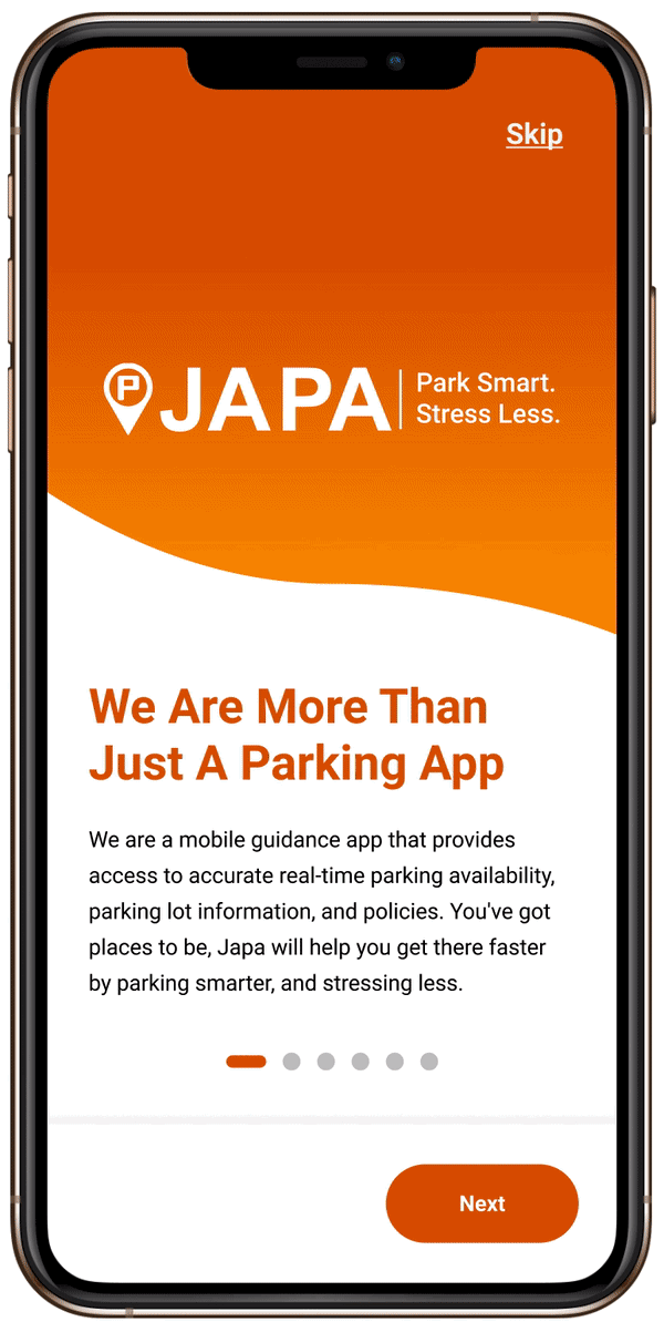
Sign In & Onboarding
Upon opening the app, users are taken through a series of screens to set up their account. This includes setting up payment information for future in-app payment implementations. Users also have the option to skip creating an account to begin exploring the app. JAPA’s orange is prominent, putting there brand identity at the forefront.
After signing up, users are taken through onboarding screens providing an overview of the app and its features.
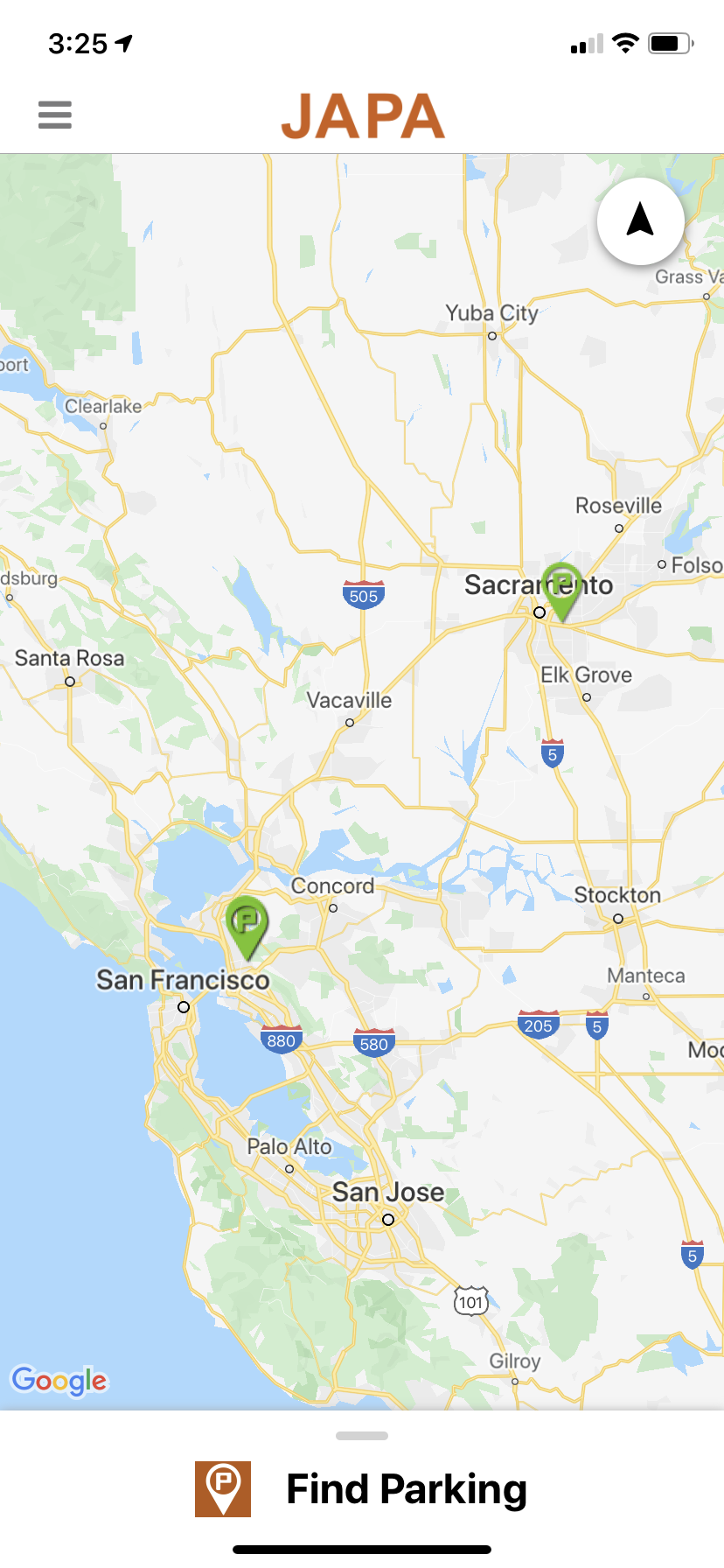
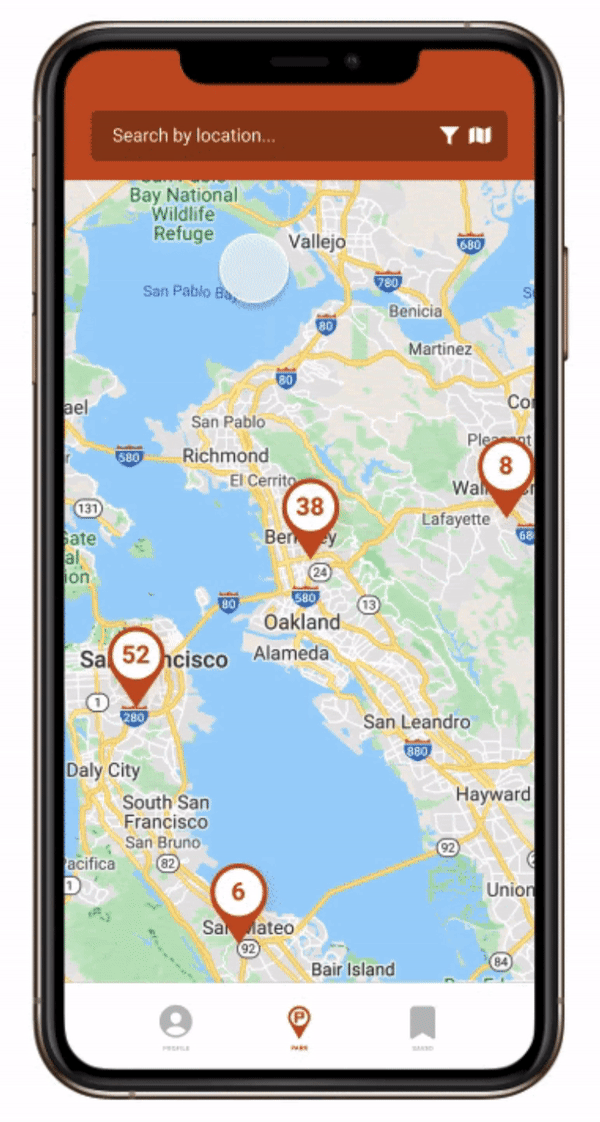
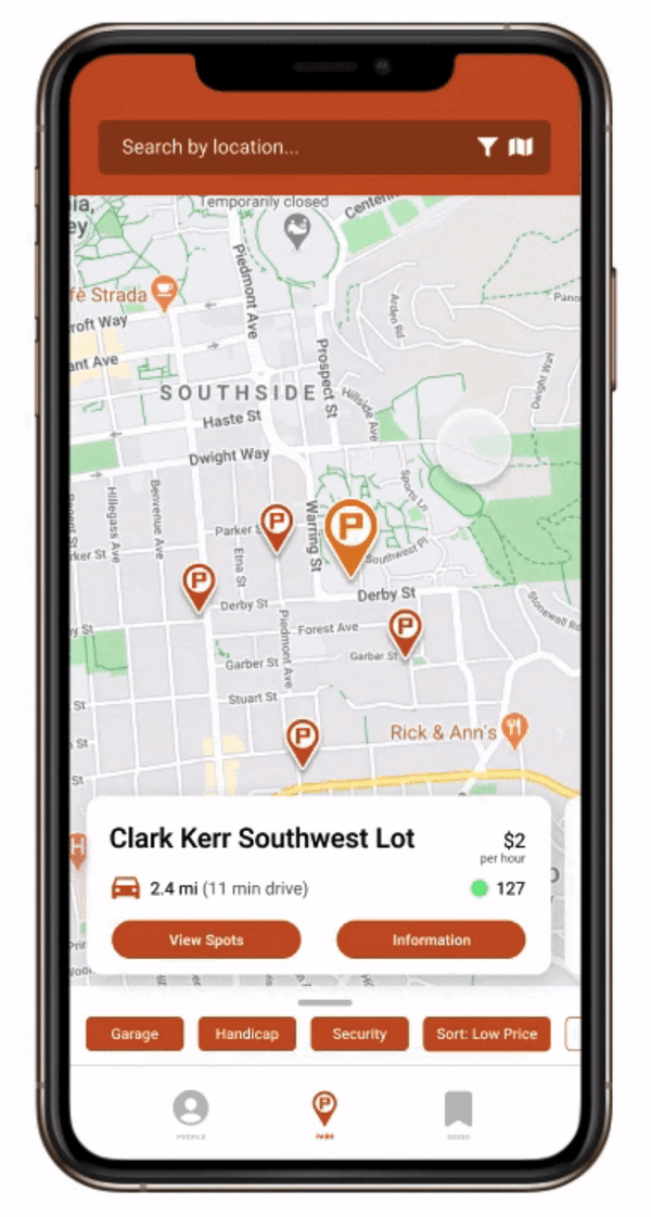
Lot Search & Filter
Finding a lot is the core of the app. Users can search by location or manually zoom into the map, and also filter their search based on their needs. Lot markers are now grouped when zoomed out in order to reduce clutter.
When looking at the available lots, the quick look feature makes it easy to swipe through lots and get a glimpse of the cost, location, and spot availability. Alternatively, users can switch to list view and scroll through all available lots in the area.
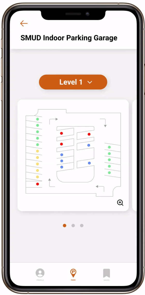
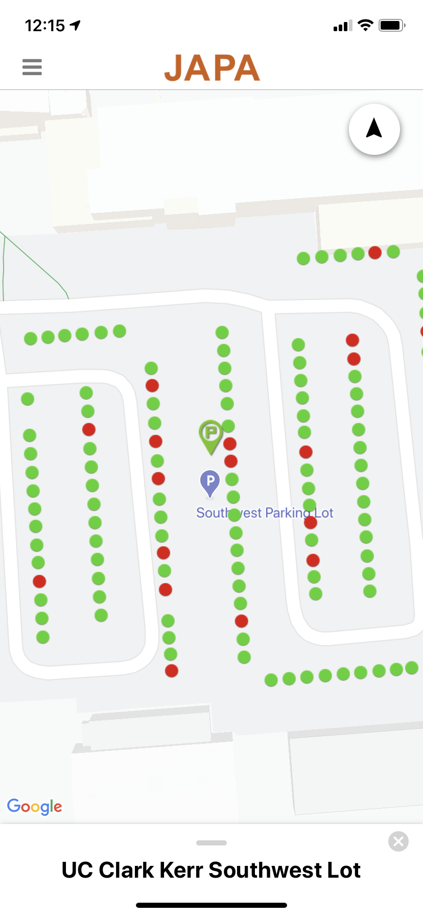
Parking Lot Layout
Upon clicking into a parking lot, users can view available parking spots. On the left is an example of the lot layout for a parking garage. Users can quickly swipe through the floors or jump to a floor with the dropdown menu. Clicking into a floor preview provides a closer look of the floor.
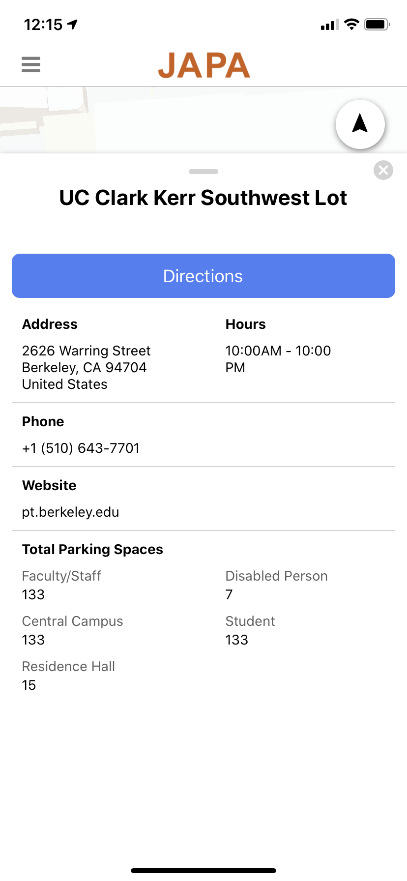
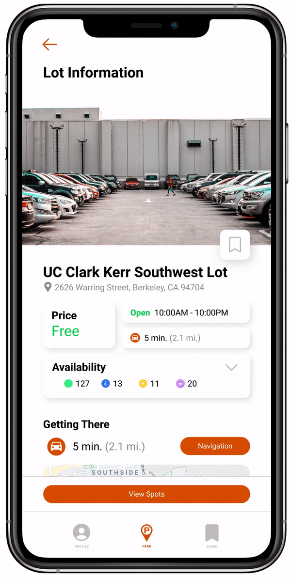
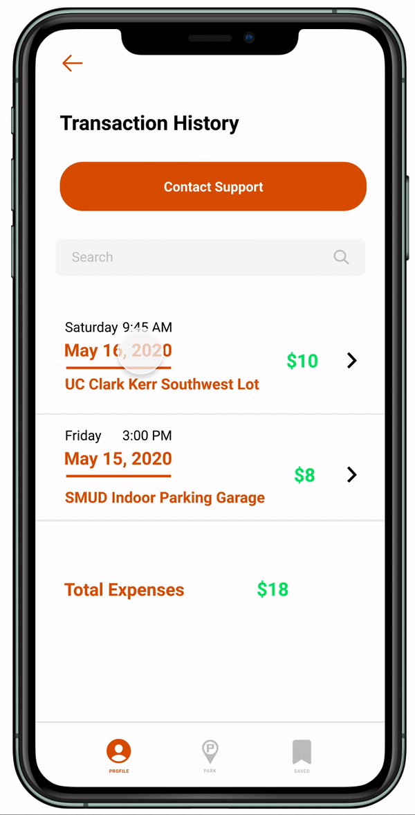
Lot Information
The lot information screen provides vital details about a parking lot. Users can add the lot to their saved lots, see lot amenities and policies, and the availability of each type of parking spot. The parking lot layout screen is also easily accessible from this page.
Navigation is now integrated, so users can view the route to the lot without ever leaving the JAPA app.
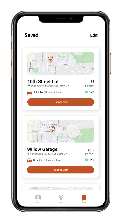
Saved Lots
One of the three navigation bar pages is the saved lots, where users can add parking lots that they frequent. This feature is geared toward the regular user groups, such as commuters and university students.
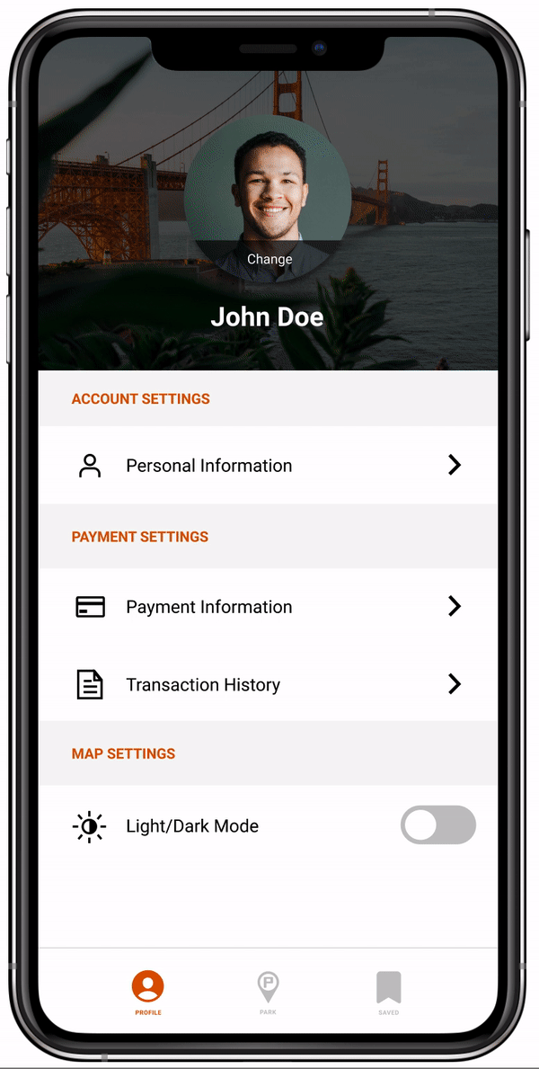
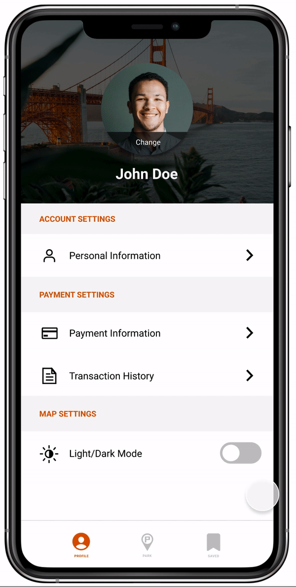
Profile & Payments
In the profile screens, users can edit their profile info, add and remove payment methods, and change their app interface theme.
Takeaways
Working on a Design Team
This was my first time working on a design project on a team. Like with collaboration in any type of project, communication becomes essential, and it was often a balancing act of our many different ideas. Throughout the five weeks, our team met very frequently to bounce ideas around and gain feedback on our designs in progress. At our very first meeting together, each of us introduced ourselves and described where our strengths were, something that helped us determine where each member could work most effectively and what we could learn from each other.
This was also my first time working with a client. This meant we needed to design for the client’s needs and vision, not just our own. With so many ideas in the air, it made it even more important to focus on our user research and make research-backed design decisions. Since this was a real app for a real company, we also needed to keep technical constraints in mind. In our weekly meetings with JAPA, our team would discuss potential app features and gain feedback on the feasibility of implementing such ideas in the actual app.
Remote Collaboration
This year was no doubt a difficult time for everyone. Working amid the pandemic, all work had to done remotely. It was tough at first losing out on that human element of working with a team, but we made it work! We had frequent video calls and used different collaborative online tools. We also still managed to conduct interviews and user testing, but now with household members or through Zoom. I’ve still never met my team members in-person! I’m really happy with what we were able to accomplish.
Exploration
I’m a computer science major, and somehow I’ve done design work a fair handful of times. I don’t plan to pursue a purely design oriented field, but I think having these design skills has helped me grow a lot even as a computer programmer. I build things with the user in mind, considering what the user of the application needs or wants. I write clean, efficient code, not just functional code. Like the way I minimized the number of screens a user passed through in the JAPA app, I minimize the lines of code in a program (while maintaining readability of course). At the time of writing this, I’m early on in college, and I’m excited to explore the different career paths I can take on.